

Project overview
Timeline
1 week
Project
Application case
Work
Research, UX analysis, wireframing, UX/UI design
The clothing chain Zara is well recognized brand among people interested in fashion. However, their website is infamous for its bad user experience. I have personally struggled using the site, as its difficult to navigate through, is confusing in both its layout and labeling, and is inaccessible to many users. This lead me to redesign parts of the website to improve the shopping experience and better fulfill the company’s business goals.
Process
Research → Persona → Analysis of current website → Wireframes → HiFi prototype
Research
I conducted research about the company to better understand their goals and needs for their website:
Target group
Women and men in the ages of 18-40
Middle income
People with an interest in fashion and trends
Business goals
Quick design, production and distribution
Make customers take fast purchase decisions
Quality, traceability and sustainability, and have a circular business model and reduce waste
Experience goals
Zara’s experience goals through all touch points are “beauty, clarity, functionality and sustainability”
Conversion goals
The conversion goals of the website has been interpreted as:
Complete a purchase
Sign up on the news letter
Persona

Problem areas
In my analysis of Zara’s website, I have focused on the desktop view as I believe it has had the most significant issues. The images display a few examples of user problems on Zara’s site.
Form over function
Zara’s website prioritizes aesthetics over user-centered features, making the site difficult and frustrating to use.
• The use of images complicates the experience since many of them don’t indicate whether they lead to a product or not. It is also challenging to determine if they are clickable due to unclear affordances.
• Some product categories are presented in a typical e-commerce layout, while others resemble inspiration boards, which is confusing. The latter lacks product descriptions unless you click on them.

Navigation and menus
The main navigation does not use conventional or clear links/language, such as “Start session” (swe) instead of “Log in”.
The product menu lacks grouping and hierarchy, making it difficult to get an overview. Products and collections are not separated. It is also scrollable, which is not evident unless you hover the mouse pointer over it. At the bottom, there are links for contact and help, which are hard to find.
On the category view, there is a carousel-like menu. It is easy to miss that it can be scrolled, and as a whole, it is an inefficient way to filter.

Accessibility
The typography used is not accessibility-friendly. The fonts are small (body text 10px), and the text is written in uppercase, making it hard to read and potentially causing issues for accessibility tools.
Using only tabs for navigation is almost impossible since it is barely visible where the current tab is.

Redesign goals
Based on the problem areas and business goals, the purpose of the redesign is to fulfill the following goals:
1. Improve navigation and menus
By making it easier to find content on the pages, it will enhance the visitor's overall experience of the site.
2. Greater focus on conversion
The homepage should place more emphasis on guiding the visitor towards the products. It should also encourage users to sign up for the newsletter.
3. Separate e-commerce and inspiration
It should be easy to find products to buy or inspiration without disrupting the user's goals or experience.
4. Improve the website’s accessibility
A website that can be used by individuals with disabilities enhances usability for all users.
Wireframing

Wireframe Home page

Wireframe Category page

Wireframe Product view
Solution
A home page with a larger emphasis on conversions
Zara now has a clear division of content, making it easier for the user to find what they are looking for. With call-to-actions and products leading, the user is directed straight to the products, increasing the likelihood of making a purchase. The newsletter is more prominent and also describes the benefits of signing up.
Effective category pages
The products are now placed in an easily scannable layout, and they are straightforward to navigate. There is also the option to add sections for collections, inspiration, or offers. These provide a diverse layout without disrupting the shopping experience.
A smarter product view
The product page now has a more familiar layout, making it easier to use. Information such as material is hidden but easily accessible through dropdown menus. If the clothes come in multiple colors, it’s quick to switch between them. The user can get inspired by the suggested products below.
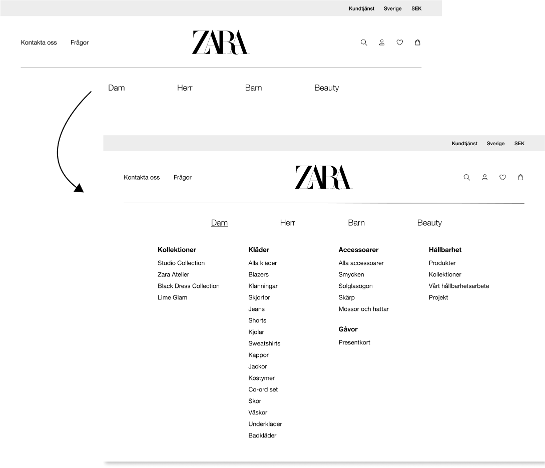
Improved navigation
The main navigation uses familiar names and symbols, making it easier for the user to find what they need. Important functions like contact and inquiries are also easily accessible, in case a customer has any questions about their purchase. It’s also quick to switch between countries or currencies.
In the product menu (accessible by hovering over the category), the categories Women, Men, Kids, and Beauty are separated. The product types are also distinct for better visibility. As Zara works towards sustainability, I believe it is essential for this information to be clear. In the product category, customers can quickly find sustainable products for those who prioritize it
Easy to find the right product
By sorting and filtering, it’s quick to find the right product. Instead of using a slider (which barely worked), the user can adjust the view using the grid buttons on the right.

Increased accessibility
The overall accessibility has been improved by:
• Avoiding using uppercase letters in body text to improve readability and the use of text-to-speech screen readers.
• Colors have improved contrast, and the background have adapted to be less straining on the eyes.
• Include breadcrumbs to make the pages easy to navigate.
• Make the states of interactive objects more clear.


